
When designing a website whether it is a blog, ecommerce store, membership site, etc. you must tweak the final design for smaller browsers like tablets and phones. Why? You are going to find out that more than half of your visitors are on a mobile device and you want them to have as good an experience as possible. Avada theme responsive settings will make this easier.
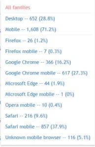
The image shows the breakdown of browser/device use of one of my websites for a period of 28 days. Mobile was over 70%!
I like to totally design a website for desktop first. Then I start tweaking it for phones and tablets. One of the reasons I like working with the Avada theme is that they now have several ways to make that tweaking easier. Let’s look at a few.