Be sure to cast your votes in the poll below; but first, let’s check out the box art designs themselves.
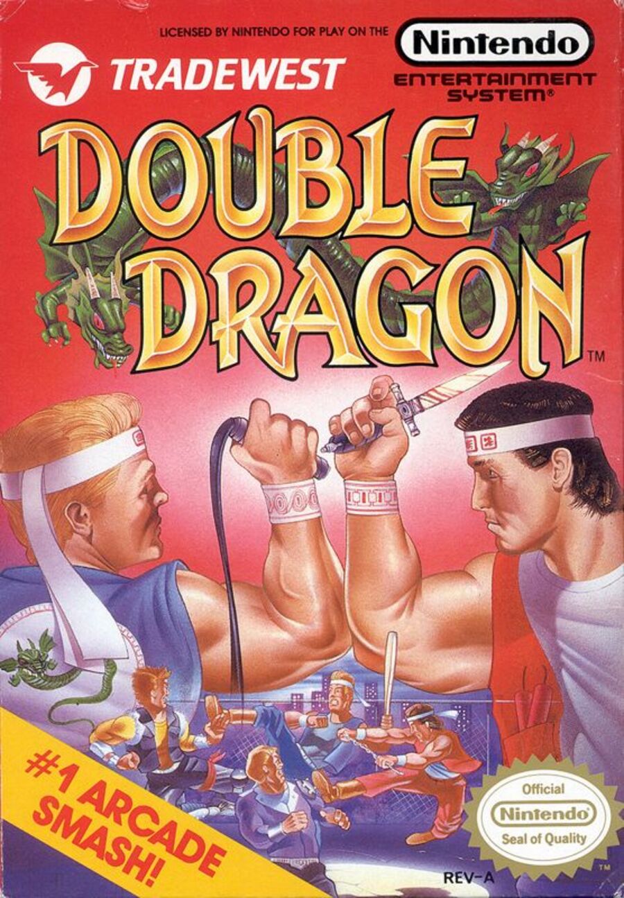
Europe / North America

Is anyone else getting some serious Arnie and Carl Weathers Predator vibes from the front and centre bicep placement here? No? Just us then.
The European and North American design has a lot going on: a full-blown street brawl in the lower quarter, two foes facing off in the foreground and a bright red backdrop — not the mention the literal Double Dragon wrapped around the title. It’s maybe a little too much, but there’s no denying that it tells you everything you need to know about the game in question.
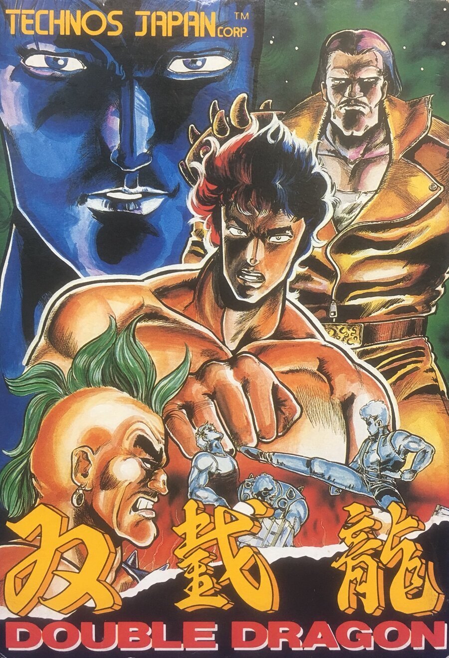
Japan

The Japanese design takes a different, more artistic approach. The relative realism of the former visuals is replaced by a manga art style and some sweet fighter composition, with large, looming figures guiding our eyes gradually down to the brawl at the bottom. It might be a little less vibrant than the EU/NA offering, but that artwork slaps.
Thanks for voting! We’ll see you next time for another round of Box Art Brawl.
Discover more from reviewer4you.com
Subscribe to get the latest posts to your email.


