

From SplitText to MorphSVG: 5 Creative Demos Using Free GSAP Plugins


linesClass: “line”,
wordsClass: “word”,
charsClass: “letter”
});
mask: "lines" wraps each line in its own container so you can do masked reveals without extra markup.
3. Hook up the buttons
Since this is a showcase, we’ve added three buttons. One each for “Lines”, “Words” and “Letters”—to let users trigger each style on demand. In a real project you might fire these tweens on scroll, on page load, or when another interaction occurs.
To keep our code a bit cleaner, we define a config object that maps each split type to its ideal duration and stagger. Because lines, words, and letters have vastly different counts, matching your timing to the number of elements ensures each animation feels tight and responsive.
If you used the same stagger for letters as you do for lines, animating dozens (or hundreds) of chars would take forever. Tailoring the stagger to the element count keeps the reveal snappy.
// 1. Define per-type timing
const config = {
  lines: { duration: 0.8, stagger: 0.08 },
  words: { duration: 0.6, stagger: 0.06 },
  letters: { duration: 0.4, stagger: 0.008 }
};
Next, our animate(type) function:
function animate(type) {
  // 1) Clean up any running tween so clicks “restart” cleanly
  if (currentTween) {
    currentTween.kill();
    gsap.set(currentTargets, { yPercent: 0 });
  }

  // 2) Pull the right timing from our config
  const { duration, stagger } = config[type];

  // 3) Match the button’s data-split-type to the CSS class
  // Our SplitText call used linesClass="line", wordsClass="word", charsClass="letter"
  const selector = type === "lines" ? ".line"
                 : type === "words" ? ".word"
                                    : ".letter";

  // 4) Query the correct elements and animate
  currentTargets = heading.querySelectorAll(selector);
  currentTween = gsap.fromTo(
    currentTargets,
    { yPercent: 110 },
    { yPercent: 0, duration, stagger, ease: "osmo-ease" }
  );
}
Notice how type (the button’s data-split-type) directly aligns with our config keys and the class names we set on each slice. This tidy mapping means you can add new types (or swap class names) without rewriting your logic—just update config (and your SplitText options) and the function auto-adapts.
Finally, tie it all together with event listeners:
const buttons = document.querySelectorAll('[data-split="button"]');

buttons.forEach(btn =>
  btn.addEventListener("click", () =>
    animate(btn.dataset.splitType)
  )
);
4. Putting it all together
Let’s put all of our JS together in one neat function, and call it as soon as our fonts are loaded. This way we avoid splitting text while a fallback font is visible, and with that, we avoid any unexpected line breaks.
// JavaScript (ensure GSAP, SplitText & CustomEase are loaded)
gsap.registerPlugin(SplitText, CustomEase);
CustomEase.create("osmo-ease", "0.625, 0.05, 0, 1");

function initSplitTextDemo() {
  const heading = document.querySelector('[data-split="heading"]');
  SplitText.create(heading, {
    type: "lines, words, chars",
    mask: "lines",
    linesClass: "line",
    wordsClass: "word",
    charsClass: "letter"
  });

  const config = {
    lines: { duration: 0.8, stagger: 0.08 },
    words: { duration: 0.6, stagger: 0.06 },
    letters: { duration: 0.4, stagger: 0.008 }
  };

  let currentTween, currentTargets;

  function animate(type) {
    if (currentTween) {
      currentTween.kill();
      gsap.set(currentTargets, { yPercent: 0 });
    }

    const { duration, stagger } = config[type];
    const selector = type === "lines" ? ".line"
                   : type === "words" ? ".word"
                                      : ".letter";

    currentTargets = heading.querySelectorAll(selector);
    currentTween = gsap.fromTo(
      currentTargets,
      { yPercent: 110 },
      { yPercent: 0, duration, stagger, ease: "osmo-ease" }
    );
  }

  document.querySelectorAll('[data-split="button"]').forEach(btn =>
    btn.addEventListener("click", () =>
      animate(btn.dataset.splitType)
    )
  );
}

document.fonts.ready.then(initSplitTextDemo);
5. Resources & links
Give it a spin yourself! Find this demo on CodePen and grab the Webflow cloneable below. For a deep dive into every available option, check out the official SplitText docs, and head over to the CustomEase documentation to learn how to craft your own easing curves.
→ CodePen
We’ll continue next with the Physics2D Text Smash demo—combining SplitText with another GSAP plugin for a totally different effect.
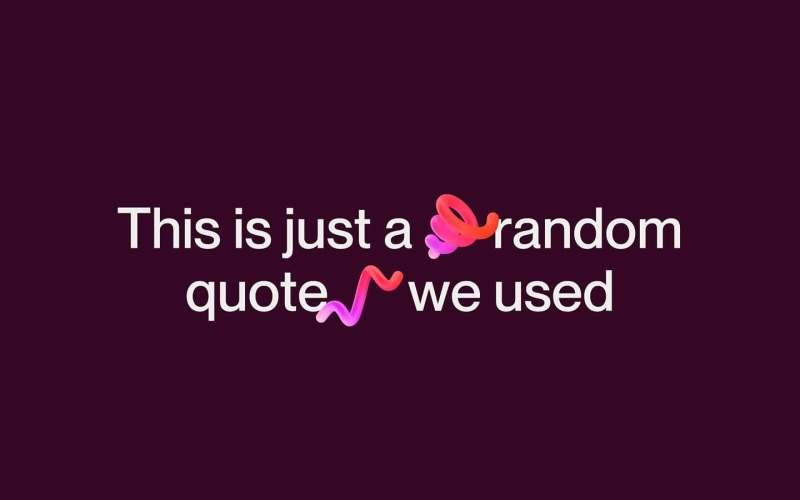
Physics2D Text Smash Demo
If you weren’t aware already, with the recent Webflow × GSAP announcements, SplitText received a major overhaul—packed with powerful new options, accessibility improvements, and a dramatically smaller bundle size. Check out the SplitText docs for all the details.
Unlike our previous demo (which was more of an interactive playground with buttons), this effect is a lot closer to a real-world application; as you scroll, each heading “breaks” into characters and falls off of your viewport like it’s hit a roof—thanks to ScrollTrigger and Physics2DPlugin.
Before we dive into code, a couple notes:
- Plugins needed: GSAP core, SplitText, ScrollTrigger, and Physics2DPlugin.
- Assets used: We’re using some squiggly, fun, 3D objects from a free pack on wannathis.one. Definitely check out their stuff, they have more fun things!
- Demo purpose: We’re combining SplitText + Physics2D on scroll so your headings shatter into characters and “fall” off the top of the viewport, as if they hit a ‘roof’.
HTML & CSS Setup
body {
  color: #efeeec;
  background-color: #340824;
}

.drop-wrapper {
  width: 100%;
  min-height: 350vh;
}

.drop-section {
  display: flex;
  justify-content: center;
  align-items: center;
  min-height: 100vh;
  position: relative;
}

.drop-heading {
  max-width: 40rem;
  margin: 0;
  font-size: 4rem;
  font-weight: 500;
  line-height: 1;
  text-align: center;
}

.drop-heading-img {
  display: inline-block;
  position: relative;
  width: 1.4em;
  z-index: 2;
}

.drop-heading-img.is--first {
  transform: rotate(-20deg) translate(.15em, -.2em);
}

.drop-heading-img.is--second {
  transform: translate(-.15em) rotate(10deg);
}

.drop-heading-img.is--third {
  transform: translate(-.05em, .1em) rotate(50deg);
  margin: 0 .1em;
}
1. Register plugins
Start by registering all of our necessary plugins
gsap.registerPlugin(ScrollTrigger, SplitText, Physics2DPlugin);2. SplitText setup
We’re using aria: true here to automatically add an aria-label on the wrapper and hide split spans from screen readers. Since the latest update, aria: true is the default, so you don’t necessarily have to add it here—but we’re highlighting it for the article.
We split the text as soon as the code runs, so that we can attach a callback to the new onSplit function, but more on that in step 3.
new SplitText("[data-drop-text]", {
  type: "lines, chars",
  autoSplit: true,  // re-split if the element resizes and it's split by lines
  aria: true, // default now, but worth highlighting!
  linesClass: "line",
});
With the recent SplitText update, there’s also a new option called autoSplit—which takes care of resize events, and re-splitting your text.
An important caveat for the autoSplit option; you should always create your animations in the (also new!) onSplit() callback so that if your text re-splits (when the container resizes or a font loads in), the resulting animations affect the freshly-created line/word/character elements instead of the ones from the previous split. If you’re planning on using a non-responsive font-size or just want to learn more about this (awesome) new feature that takes care of responsive line splitting, check out the documentation here.
3. Trigger on scroll
In our onSplit callback, we loop over each line in the heading, inside of a context. This context, which we return at the end, makes sure GSAP can clean up this animation whenever the text re-splits.
In our loop, we create a ScrollTrigger for each line, and we set once: true, so our animation only fires once. In step 4 we’ll add our animation!
It’s worth playing around with the start values to really nail the moment where your text visually ‘touches’ the top of the window. For our font, size, and line-height combo, an offset of 10px worked great.
new SplitText("[data-drop-text]", {
  type: "lines, chars",
  autoSplit: true,
  aria: true,
  linesClass: "line",
  onSplit(self) {
    // use a context to collect up all the animations
    let ctx = gsap.context(() => {
      self.lines.forEach((line) => { // loop around the lines
        gsap.timeline({
          scrollTrigger: {
            once: true, // only fire once
            trigger: line, // use the line as a trigger
            start: "top top-=10" // adjust the trigger point to your liking
          }
        })
      });
    });

    return ctx; // return our animations so GSAP can clean them up when onSplit fires
  }
});
4. Drop the letters with Physics2D
Now, let’s add 2 tweens to our timeline. The first one, using the Physics2D plugin, sends each child element of the line, flying straight down with randomized velocity, angle, and gravity. A second tween makes sure the elements are faded out towards the end.
new SplitText("[data-drop-text]", {
  type: "lines, chars",
  autoSplit: true,
  aria: true,
  linesClass: "line",
  onSplit(self) {
    // use a context to collect up all the animations
    let ctx = gsap.context(() => {
      self.lines.forEach((line) => { // loop around the lines
        gsap.timeline({
          scrollTrigger: {
            once: true, // only fire once
            trigger: line, // use the line as a trigger
            start: "top top-=10" // adjust the trigger point to your liking
          }
        })
        .to(line.children, { // target the children
          duration: "random(1.5, 3)", // Use randomized values for a more dynamic animation
          physics2D: {
            velocity: "random(500, 1000)",
            angle: 90,
            gravity: 3000
          },
          rotation: "random(-90, 90)",
          ease: "none"
        })
        .to(line.children,{ // Start fading them out
          autoAlpha: 0,
          duration: 0.2
         }, "-=.2");
      });
    });

    return ctx; // return our animations so GSAP can clean them up when onSplit fires
  }
});
Tip: use gsap.utils.random()! Giving each char and image a slightly different speed and spin creates a joyful, and more natural feeling to it all.
5. Putting it all together
gsap.registerPlugin(ScrollTrigger, SplitText, Physics2DPlugin);

function initDroppingText() {
  new SplitText("[data-drop-text]", {
    type: "lines, chars",
    autoSplit: true,
    aria: true,
    linesClass: "line",
    onSplit(self) {
      // use a context to collect up all the animations
      let ctx = gsap.context(() => {
        self.lines.forEach((line) => {
          gsap
            .timeline({
              scrollTrigger: {
                once: true,
                trigger: line,
                start: "top top-=10"
              }
            })
            .to(line.children, { // target the children
              duration: "random(1.5, 3)", // Use randomized values for a more dynamic animation
              physics2D: {
                velocity: "random(500, 1000)",
                angle: 90,
                gravity: 3000
              },
              rotation: "random(-90, 90)",
              ease: "none"
            })
            .to(
              line.children,
              {
                autoAlpha: 0,
                duration: 0.2
              },
              "-=.2"
            );
        });
      });

      return ctx; // return our animations so GSAP can clean them up when onSplit fires
    }
  });
}

document.addEventListener("DOMContentLoaded", initDroppingText);
6. Resources & links
→ CodePen
Next up: an interactive Inertia Dot Grid that springs and flows with your cursor!
Glowing Interactive Dot Grid
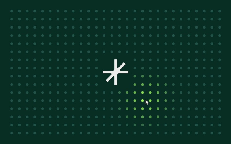
InertiaPlugin (formerly ThrowPropsPlugin) allows you to smoothly glide any property to a stop, honoring an initial velocity as well as applying optional restrictions on the end value. It brings real-world momentum to your elements, letting them move with an initial velocity and smoothly slow under configurable resistance. You simply specify a starting velocity and resistance value, and the plugin handles the physics.
In this demo, we’re using a quick-to-prototype grid of
Before we dive in:
- Plugins needed: GSAP core and InertiaPlugin.
- Demo purpose: Build a responsive grid of dots that glow with proximity and spring away on fast mouse moves or clicks—showcasing how the InertiaPlugin can add playful, physics-based reactions to a layout.
HTML & CSS Setup
body {
  overscroll-behavior: none;
  background-color: #08342a;
  color: #efeeec;
}

.dots-container {
  position: absolute;
  inset: 4em;
  display: flex;
  flex-flow: wrap;
  gap: 2em;
  justify-content: center;
  align-items: center;
  pointer-events: none;
}

.dot {
  position: relative;
  width: 1em;
  height: 1em;
  border-radius: 50%;
  background-color: #245e51;
  transform-origin: center;
  will-change: transform, background-color;
  transform: translate(0);
  place-self: center;
}

.section-resource {
  color: #efeeec;
  justify-content: center;
  align-items: center;
  display: flex;
  position: absolute;
  inset: 0;
}

.osmo-icon-svg {
  width: 10em;
}

.osmo-icon__link {
  color: currentColor;
  text-decoration: none;
}
1. Register plugins
gsap.registerPlugin(InertiaPlugin);2. Build your grid & optional center hole
First, wrap everything in an initGlowingInteractiveDotsGrid() function and declare your tweakable parameters—colors, glow distance, speed thresholds, shockwave settings, max pointer speed, and whether to carve out a center hole for a logo. We also set up two arrays, dots and dotCenters, to track the elements and their positions.
function initGlowingInteractiveDotsGrid() {
  const container = document.querySelector('[data-dots-container-init]');
  const colors = { base: "#245E51", active: "#A8FF51" };
  const threshold = 200;
  const speedThreshold = 100;
  const shockRadius = 325;
  const shockPower = 5;
  const maxSpeed = 5000;
  const centerHole = true;
  let dots = [];
  let dotCenters = [];

  // buildGrid(), mousemove & click handlers defined next…
}
With those in place, buildGrid() figures out how many columns and rows fit based on your container’s em sizing, then optionally carves out a perfectly centered block of 4 or 5 columns/rows (depending on whether the grid dimensions are even or odd) if centerHole is true. That hole gives space for your logo; set centerHole = false to fill every cell.
Inside buildGrid(), we:
- Clear out any existing dots and reset our arrays.
- Read the container’s fontSize to get dotPx (in px) and derive gapPx.
- Calculate how many columns and rows fit, plus the total cells.
- Compute a centered “hole” of 4 or 5 columns/rows if centerHole is true, so you can place a logo or focal element.
function buildGrid() {
  container.innerHTML = "";
  dots = [];
  dotCenters = [];

  const style = getComputedStyle(container);
  const dotPx = parseFloat(style.fontSize);
  const gapPx = dotPx * 2;
  const contW = container.clientWidth;
  const contH = container.clientHeight;
  const cols = Math.floor((contW + gapPx) / (dotPx + gapPx));
  const rows = Math.floor((contH + gapPx) / (dotPx + gapPx));
  const total = cols * rows;

  const holeCols = centerHole ? (cols % 2 === 0 ? 4 : 5) : 0;
  const holeRows = centerHole ? (rows % 2 === 0 ? 4 : 5) : 0;
  const startCol = (cols - holeCols) / 2;
  const startRow = (rows - holeRows) / 2;

  // …next: loop through each cell to create dots…
}
Now loop over every cell index. Inside that loop, we hide any dot in the hole region and initialize the visible ones with GSAP’s set(). Each dot is appended to the container and pushed into our dots array for tracking.
For each dot:
- If it falls in the hole region, we hide it.
- Otherwise, we position it at { x: 0, y: 0 } with the base color and mark it as not yet sprung.
- Append it to the container and track it in dots.
// ... add this to the buildGrid() function

for (let i = 0; i = startRow &&
    row = startCol &&
    col
Finally, once the DOM is updated, measure each visible dot’s center coordinate—including any scroll offset—so we can calculate distances later. Wrapping in requestAnimationFrame ensures the layout is settled.
// ... add this to the buildGrid() function

requestAnimationFrame(() => {
  dotCenters = dots
    .filter(d => !d._isHole)
    .map(d => {
      const r = d.getBoundingClientRect();
      return {
        el: d,
        x: r.left + window.scrollX + r.width / 2,
        y: r.top + window.scrollY + r.height / 2
      };
    });
});

// this is the end of the buildGrid() function
By now, the complete buildGrid() function will look like the following:
function buildGrid() {
  container.innerHTML = "";
  dots = [];
  dotCenters = [];

  const style = getComputedStyle(container);
  const dotPx = parseFloat(style.fontSize);
  const gapPx = dotPx * 2;
  const contW = container.clientWidth;
  const contH = container.clientHeight;
  const cols = Math.floor((contW + gapPx) / (dotPx + gapPx));
  const rows = Math.floor((contH + gapPx) / (dotPx + gapPx));
  const total = cols * rows;

  const holeCols = centerHole ? (cols % 2 === 0 ? 4 : 5) : 0;
  const holeRows = centerHole ? (rows % 2 === 0 ? 4 : 5) : 0;
  const startCol = (cols - holeCols) / 2;
  const startRow = (rows - holeRows) / 2;

  for (let i = 0; i = startRow && row = startCol && col  {
    dotCenters = dots
      .filter(d => !d._isHole)
      .map(d => {
        const r = d.getBoundingClientRect();
        return {
          el: d,
          x: r.left + window.scrollX + r.width / 2,
          y: r.top + window.scrollY + r.height / 2
        };
      });
  });
}
At the end of initGlowingInteractiveDotsGrid(), we attach a resize listener and invoke buildGrid() once to kick things off:
window.addEventListener("resize", buildGrid);
buildGrid();
3. Handle mouse move interactions
As the user moves their cursor, we calculate its velocity by comparing the current e.pageX/e.pageY to the last recorded position over time (dt). We clamp that speed to maxSpeed to avoid runaway values. Then, on the next animation frame, we loop through each dot’s center:
- Compute its distance to the cursor and derive
t = Math.max(0, 1 - dist / threshold). - Interpolate its color from
colors.basetocolors.active. - If
speed > speedThresholdand the dot is within threshold, mark it_inertiaAppliedand fire an inertia tween to push it away before it springs back.
All this still goes inside of our initGlowingInteractiveDotsGrid() function:
let lastTime = 0
let lastX = 0
let lastY = 0

window.addEventListener("mousemove", e => {
  const now = performance.now()
  const dt = now - lastTime || 16
  let dx = e.pageX - lastX
  let dy = e.pageY - lastY
  let vx = (dx / dt) * 1000
  let vy = (dy / dt) * 1000
  let speed = Math.hypot(vx, vy)

  if (speed > maxSpeed) {
    const scale = maxSpeed / speed
    vx = vx * scale
    vy = vy * scale
    speed = maxSpeed
  }

  lastTime = now
  lastX = e.pageX
  lastY = e.pageY

  requestAnimationFrame(() => {
    dotCenters.forEach(({ el, x, y }) => {
      const dist = Math.hypot(x - e.pageX, y - e.pageY)
      const t = Math.max(0, 1 - dist / threshold)
      const col = gsap.utils.interpolate(colors.base, colors.active, t)
      gsap.set(el, { backgroundColor: col })

      if (speed > speedThreshold && dist
4. Handle click ‘shockwave’ effect
On each click, we send a radial ‘shockwave’ through the grid. We reuse the same inertia + elastic return logic, but scale the push by a distance-based falloff so that dots closer to the click move further, then all spring back in unison.
window.addEventListener("click", e => {
  dotCenters.forEach(({ el, x, y }) => {
    const dist = Math.hypot(x - e.pageX, y - e.pageY)
    if (dist
5. Putting it all together
By now, all of our pieces live inside one initGlowingInteractiveDotsGrid() function. Here’s an abbreviated view of your final JS setup:
gsap.registerPlugin(InertiaPlugin);

function initGlowingInteractiveDotsGrid() {
  // buildGrid(): creates and positions dots
  // window.addEventListener("mousemove", …): glow & spring logic
  // window.addEventListener("click", …): shockwave logic
}

document.addEventListener("DOMContentLoaded", initGlowingInteractiveDotsGrid);
6. Resources & links
→ CodePen
Next up: DrawSVG Scribbles Demo — let’s draw some playful, randomized underlines on hover!
DrawSVG Scribbles Demo
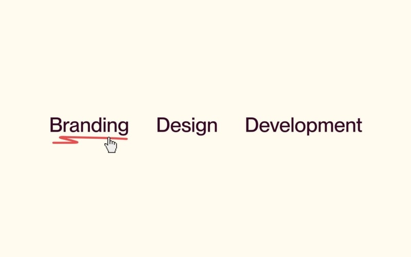
GSAP’s DrawSVGPlugin animates the stroke of an SVG path by tweening its stroke-dasharray and stroke-dashoffset, creating a ‘drawing’ effect. You can control start/end percentages, duration, easing, and even stagger multiple paths. In this demo, we’ll attach a randomized scribble underline to each link on hover—perfect for adding a playful touch to your navigation or call-to-actions.
- Plugins needed: GSAP core and DrawSVGPlugin
- Demo purpose: On hover, inject a random SVG scribbles beneath your link text and animate it from 0% to 100% draw, then erase it on hover-out.
HTML & CSS Setup
    Branding


    Design


    Development
body {
  background-color: #fefaee;
}
.section-resource {
  display: flex;
  justify-content: center;
  align-items: center;
  min-height: 100vh;
  font-size: 1.5vw;
}
.text-draw {
  color: #340824;
  cursor: pointer;
  margin: 0 1em;
  font-size: 2em;
  text-decoration: none;
}
.text-draw__p {
  margin-bottom: 0;
  font-size: 1.5em;
  font-weight: 500;
  line-height: 1.1;
}
.text-draw__box {
  position: relative;
  width: 100%;
  height: .625em;
  color: #e55050;
}
.text-draw__box-svg {
  position: absolute;
  top: 0;
  left: 0;
  width: 100%;
  height: 100%;
  overflow: visible !important;
}
1. Register the plugin
gsap.registerPlugin(DrawSVGPlugin);2. Prepare your SVG variants
We define an array of exact SVG scribbles. Each string is a standalone with its decorateSVG() to ensure it scales to its container and uses currentColor for theming.
We’ve drawn these scribbles ourselves in figma using the pencil. We recommend drawing (and thus creating the path coordinates) in the order of which you want to draw them.
const svgVariants = [
    ``,
    ``,
    ``,
    ``,
    ``,
    ``
  ];

function decorateSVG(svgEl) {
  svgEl.setAttribute('class', 'text-draw__box-svg');
  svgEl.setAttribute('preserveAspectRatio', 'none');
  svgEl.querySelectorAll('path').forEach(path => {
    path.setAttribute('stroke', 'currentColor');
  });
}
3. Set up hover animations
For each link, we listen for mouseenter and mouseleave. On hover-in, we:
- Prevent restarting if the previous draw-in tween is still active.
- Kill any ongoing draw-out tween.
- Pick the next SVG variant (cycling through the array).
- Inject it into the box, decorate it, set its initial drawSVG to “0%”, then tween to “100%” in 0.5s with an ease of
power2.inOut.
On hover-out, we tween drawSVG from “100% 100%” to erase it, then clear the SVG when complete.
let nextIndex = null;

document.querySelectorAll('[data-draw-line]').forEach(container => {
  const box = container.querySelector('[data-draw-line-box]');
  if (!box) return;
  let enterTween = null;
  let leaveTween = null;

  container.addEventListener('mouseenter', () => {
    if (enterTween && enterTween.isActive()) return;
    if (leaveTween && leaveTween.isActive()) leaveTween.kill();

    if (nextIndex === null) {
      nextIndex = Math.floor(Math.random() * svgVariants.length);
    }

    box.innerHTML = svgVariants[nextIndex];
    const svg = box.querySelector('svg');
    if (svg) {
      decorateSVG(svg);
      const path = svg.querySelector('path');
      gsap.set(path, { drawSVG: '0%' });
      enterTween = gsap.to(path, {
        duration: 0.5,
        drawSVG: '100%',
        ease: 'power2.inOut',
        onComplete: () => { enterTween = null; }
      });
    }

    nextIndex = (nextIndex + 1) % svgVariants.length;
  });

  container.addEventListener('mouseleave', () => {
    const path = box.querySelector('path');
    if (!path) return;

    const playOut = () => {
      if (leaveTween && leaveTween.isActive()) return;
      leaveTween = gsap.to(path, {
        duration: 0.5,
        drawSVG: '100% 100%',
        ease: 'power2.inOut',
        onComplete: () => {
          leaveTween = null;
          box.innerHTML = '';
        }
      });
    };

    if (enterTween && enterTween.isActive()) {
      enterTween.eventCallback('onComplete', playOut);
    } else {
      playOut();
    }
  });
});
4. Initialize on page load
Wrap the above setup in your initDrawRandomUnderline() function and call it once the DOM is ready:
function initDrawRandomUnderline() {
  // svgVariants, decorateSVG, and all event listeners…
}

document.addEventListener('DOMContentLoaded', initDrawRandomUnderline);
5. Resources & links
→ CodePen
And now on to the final demo: MorphSVG Toggle Demo—see how to morph one icon into another in a single tween!
MorphSVG Toggle Demo

MorphSVGPlugin lets you fluidly morph one SVG shape into another—even when they have different numbers of points—by intelligently mapping anchor points. You can choose the morphing algorithm (size, position or complexity), control easing, duration, and even add rotation to make the transition feel extra smooth. In this demo, we’re toggling between a play ► and pause ❚❚ icon on button click, then flipping back. Perfect for video players, music apps, or any interactive control.
We highly recommend diving into the docs for this plugin, as there are a whole bunch of options and possibilities.
- Plugins needed: GSAP core and MorphSVGPlugin
- Demo purpose: Build a play/pause button that seamlessly morphs its SVG path on each click.
HTML & CSS Setup
body {
  background-color: #0e100f;
  color: #fffce1;
  display: flex;
  flex-direction: column;
  align-items: center;
  justify-content: center;
  height: 100vh;
  margin: 0;
}

.play-pause-button {
  background: transparent;
  border: none;
  width: 10rem;
  height: 10rem;
  display: flex;
  align-items: center;
  justify-content: center;
  color: currentColor;
  cursor: pointer;
}

.play-pause-icon {
  width: 100%;
  height: 100%;
}
1. Register the plugin
gsap.registerPlugin(MorphSVGPlugin);2. Define paths & toggle logic
We store two path definitions: playPath and pausePath, then grab our button and the isPlaying boolean tracks state. On each click, we call gsap.to() on the SVG path, passing morphSVG options:
- type: “rotational” to smoothly rotate points into place
- map: “complexity” to match by number of anchors for speed
- shape set to the opposite icon’s path
Finally, we flip isPlaying so the next click morphs back.
function initMorphingPlayPauseToggle() {
  const playPath =
    "M3.5 5L3.50049 3.9468C3.50049 3.177 4.33382 2.69588 5.00049 3.08078L20.0005 11.741C20.6672 12.1259 20.6672 13.0882 20.0005 13.4731L17.2388 15.1412L17.0055 15.2759M3.50049 8L3.50049 21.2673C3.50049 22.0371 4.33382 22.5182 5.00049 22.1333L14.1192 16.9423L14.4074 16.7759";
  const pausePath =
    "M15.5004 4.05859V5.0638V5.58691V8.58691V15.5869V19.5869V21.2549M8.5 3.96094V10.3721V17V19L8.5 21";

  const buttonToggle = document.querySelector('[data-play-pause="toggle"]');
  const iconPath = buttonToggle.querySelector('[data-play-pause="path"]');
  let isPlaying = false;

  buttonToggle.addEventListener("click", () => {
    gsap.to(iconPath, {
      duration: 0.5,
      ease: "power4.inOut",
      morphSVG: {
        type: "rotational",
        map: "complexity",
        shape: isPlaying ? playPath : pausePath
      }
    });
    isPlaying = !isPlaying;
  });
}

document.addEventListener("DOMContentLoaded", initMorphingPlayPauseToggle);
4. Resources & links
- MorphSVGPlugin docs
- Bonus: We also added a confetti effect on click using the Physics2DPlugin for the below Webflow and CodePen resources!
→ CodePen
And that wraps up our MorphSVG Toggle!
Closing thoughts
Thank you for making it this far down the page! We know it’s a rather long read, so we hope there’s some inspiring stuff in here for you. Both Dennis and I are super stoked with all the GSAP Plugins being free now, and can’t wait to create more resources with them.
As a note, we’re fully aware that all the HTML and markup in the article is rather concise, and definitely not up to standard with all best practices for accessibility. To make these resources production-ready, definitely look for guidance on the standards at w3.org! Think of the above ones as your launch-pad. Ready to tweak and make your own.
Have a lovely rest of your day, or night, wherever you are. Happy animating!
Access a growing library of resources

Built by two award-winning creative developers Dennis Snellenberg and Ilja van Eck, our vault gives you access to the techniques, components, code, and tools behind our projects. All neatly packed in a custom-built dashboard. Build, tweak, and make them your own—for Webflow and non-Webflow users.
Become a member today to unlock our growing set of components and join a community of more than 850 creative developers worldwide!


