

Most pilots start out with the Federal Aviation Administration’s (FAA) charts, but at some point in their career, they have to make the switch to Jeppesen plates. The transition between the two charts can be confusing which is why this article will cover the differences between Jeppesen and FAA charts in depth.
The main difference between Jeppesen plates and FAA charts is the location of the information. Whenever possible, Jeppesen charts consolidate the information into one easy-to-read spot.
They also have a patented “briefing strip” so instrument pilots can find everything they need at the top of the approach plate. Both also use slightly different graphics.
I am not here to argue which is better. I have used both extensively for my job with a regional airline and for the military. They both have their ups and downs. For example, I absolutely hate the Jeppesen sectional charts, but I adore Jeppesen’s approach plates and airport diagrams.
Either way, you’re here to learn the differences so let’s start with the most basic differences.
How are airport diagrams different between Jeppesen and FAA charts?
First, you need to understand the main difference between the Jeppesen and FAA charts is the Jeppesen pack EVERYTHING onto one page (or two pages for big airports).
The FAA charts, on the other hand, distribute the same information in several different locations. You will need to go to the Airport Facility Directory, the Takeoff minimums and Alternate Minimums, LAHSO, and Airport Diagram to get the same information you will find on one page of a Jeppesen plate.
Check it out. Here are the two plates with the Jeppesen plates at the top and the FAA charts on the bottom.
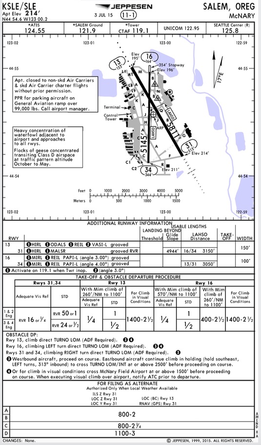
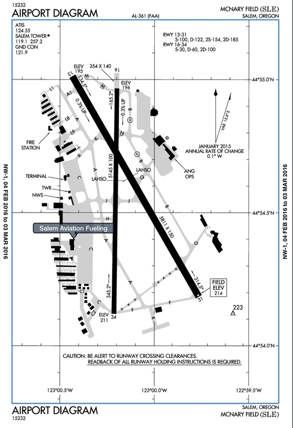
Difference #1: Chart numbers
You will notice the chart numbers are different. Each organization uses its own labeling system so you can’t move back and forth between them. A “15232” FAA chart means nothing in the Jeppesen world.
Check it out:


Difference #2: Frequency location
Look at the examples above. The frequencies above are jammed into the left-hand corner.
The Jeppesen plates layout the important frequencies in an easy to read chart at the top of the airport diagram. This is a nice feature Jeppesen carries over to the approach plates as well.
Difference #3: Size of the airport diagram and lat long lines
The Jeppesen plates substantially reduce the size of the actual diagram so they can jam a whole bunch of information in one location.
The Jepp charts put the lat/long lines off to the side of the chart in an effort to keep the clutter off the diagram.
Notice the FAA charts run the lat/long lines through the plate, which is kind of nice because that’s how maps look, but it does add clutter.
Also, the official lat/long of the airport is at the top of the Jepp plate, but in the FAA chart you have to dig for the official airport location in the A/FD.


Difference #4: Airport Elevation and Runway heading
When you line up on the runway, most of the time the runway is off a few degrees from the actual runway heading.
For example, in Salem, the runway is 310, but when you line up, if you centered your HSI’s bug, it would actually be 313 degrees.
The Jepp plates as seen below easily highlight this, but the FAA charts put this number off to the side. Surprisingly the FAA and Jepp charts have to different numbers for the actual runway heading.
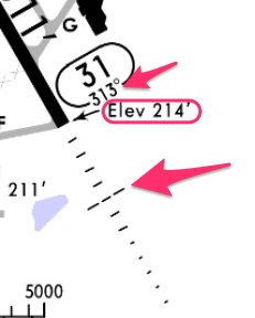
Above is a Jepp chart with the actual runway heading underneath the runway. It also has runway lighting.
While it does note the elevation, it doesn’t prominently display it as the official field elevation. You have to go to the top of the airport diagram to get the official field elevation.
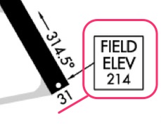
FAA chart with the Field Elevation prominently boxed. The actual runway heading is 314.5 which is on the side of the runway not under the runway direction.
Note the absence of the runway lighting system. You have to go to the approach plate to get the type of lighting for runway 31.
Difference #5: Airport Remarks
The Jeppesen puts important airport remarks right on the front of the plate. Check out this one:
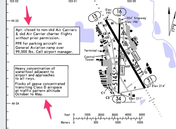
The FAA charts bury the same information in the A/FD:

I have noticed the Jepp charts do leave out a lot of information from the A/FD. For example, the Jeppesen charts tell you to call the airport manager to get a PPR, but nowhere on the Jepp chart will you find that phone number. The FAA’s A/FD though does have the phone number in the airport remarks section.
I presume with the Jeppesen charts you would have to go to Skyvector.com, or somewhere else to get that information. I can’t find an equivalent Airport Facilities directory for Jeppesen plates.
By the way, you can go to the FAA’s website to get all the A/FD for free: Airport/Facility Directory.
Difference #6: Additional Runway Information
You are out of luck if you want additional runway information on the FAA charts. You need to dig through the Airport Facility director to get the information. You also need to decipher the FAA information once you find it.
Here is the FAA’s A/FD for KSLE. I underlined some of the information also found in the Jepp chart.
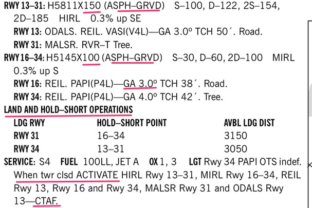
Here is the same information right under the airport diagram on the Jeppesen plate:

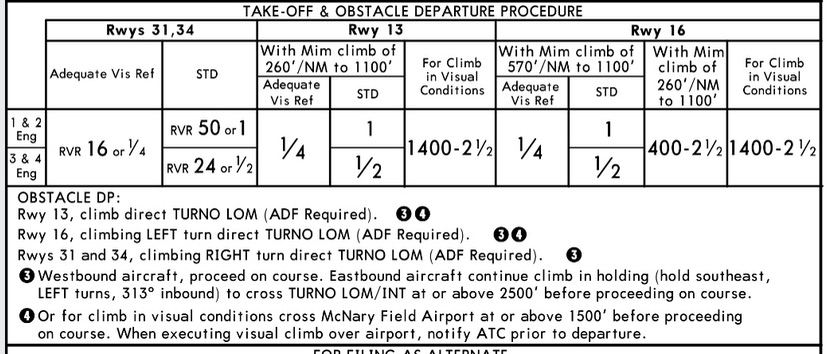
Difference #7: Takeoff and Obstacle Departure Procedure (ODP)
Actually, the more I look at the Jeppesen charts the more I fall in love with them. Having the ODP on the airport diagram is ace!
Even with Foreflight, you still have to scroll through tons of pages to get to the ODP for the airport. If there is one thing I could change about Foreflight, I would make the ODP immediately instead of scrolling. Anyway…
To get to the ODP in the FAA charts you have to go to this publication and scroll through pages and pages to find your airport:

and when you get there it looks like this:
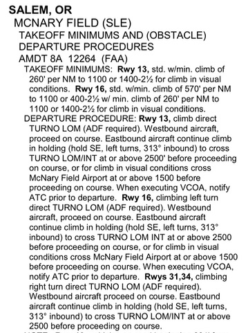
But, with the Jeppesen plate, the information is right there for you in an easy-to-read table:
TEACHING TANGENT:
Takeoff minimums and climb gradients are unbelievably confusing for new instrument pilots.
I have written two in-depth articles on takeoff minimums:
Just a quick note, Part 91 instrument rated general aviation pilots have no takeoff minimums, they can take off in zero-zerio conditions.
However, taking off in zero zero conditions is extremely stupid. Therefore, if you are a GA pilot, I highly recommend you abide by the standard takeoff minimum criteria. Or read the “standard takeoff minimums” article where I recommend four different suggestions for setting personal takeoff minimums.
Okay back to the article and the last difference in the airport diagrams:
Difference #8: Alternate minimums
Like the takeoff minimums, the alternate minimums are on the airport diagram in the Jeppesen plates.

You will have to dig for them in the FAA charts by going here:
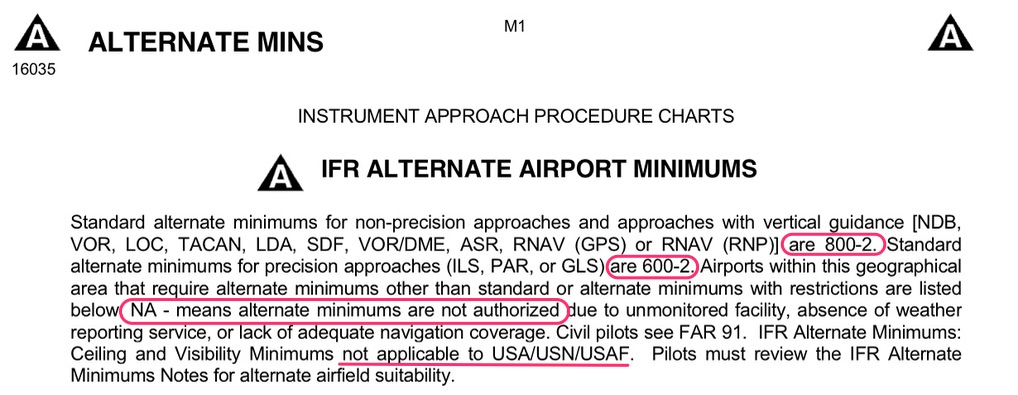
I took the liberty of highlighting the standard alternate airport minimums you should know.
So, when you flip through the FAA’s alternate minimums list you will get to Salem, OR and see this: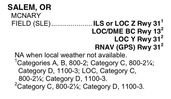
It’s the same as the Jeppesen chart, just not as well laid out.
TEACHING TANGENT:
Wondering what the different categories are for aircraft? You should know what category your aircraft falls into. Here is a chart to help you out from Wikepedia:
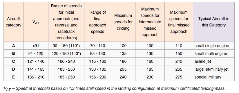
Note: this chart uses V(at) which is ICAO’s way of saying V(ref). Here is the definition of V(ref) for you airplane pilots:
 When you need to figure out what your aircraft’s V(ref) speed is, think of it as the speed you are at when crossing the threshold at 50 feet. So, in the King Air it ranges from 94-100 knots. Therefore, the King Air is a Category B aircraft.
It gets confusing when your aircraft’s speeds on approach sometimes straddle two categories in icing or high wind situations (like the Q400). In that case, use the higher Category because the minimums are usually higher and will add an additional safety margin.
Helicopter pilots: you will usually use Category A since you don’t have flaps and can slow down really well. If you fly big helicopters you may use something different, but probably not more than Category B.
One more thing…..
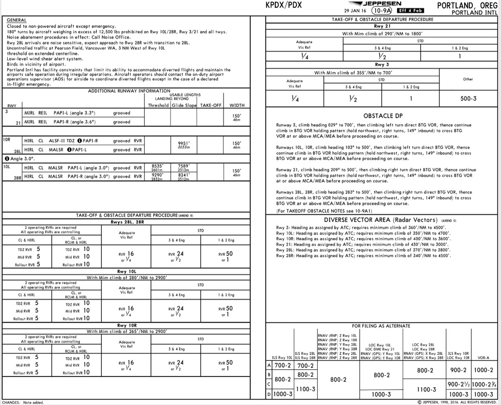
At larger airports, Jeppesen can’t fit all the information onto one page so you will always have two pages.
Check out Jeppesen’s Portland International Airport charts: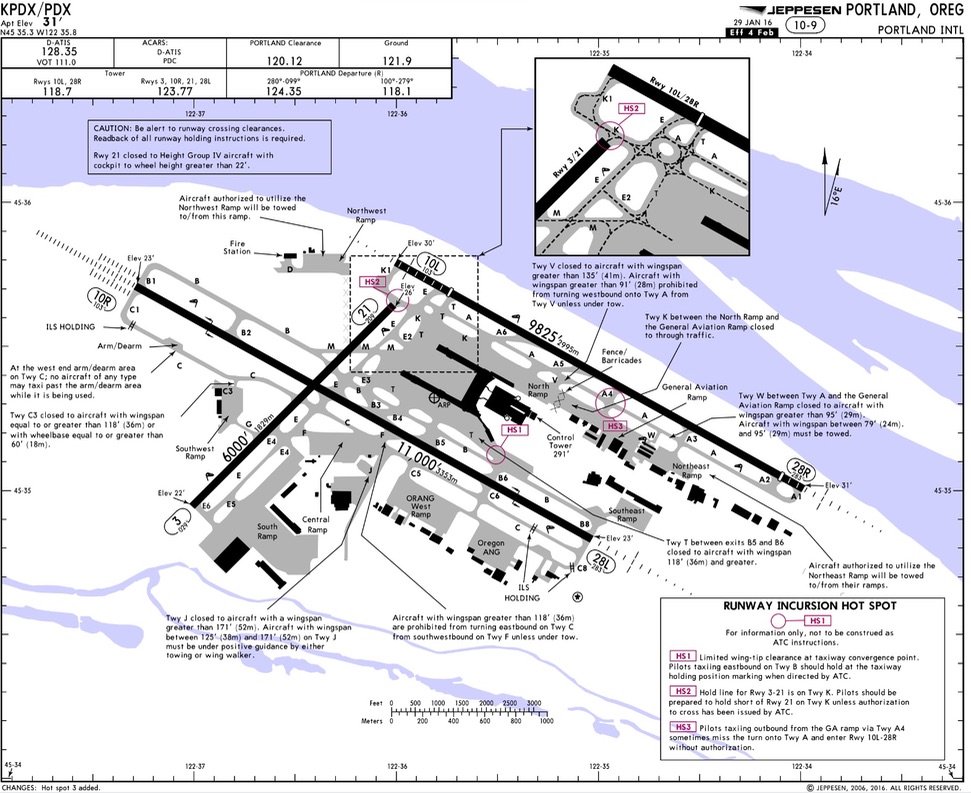
So, that’s it for airport diagrams. Next, we’ll cover approach plates.
What are the differences between Jeppesen and FAA approach charts?
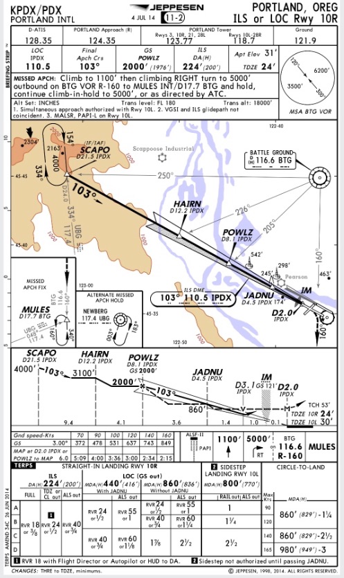
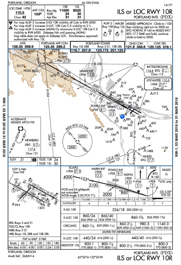
Let’s start with some examples. Take a second to digest the different plates.
The first is the Jeppesen plate for the ILS into KPDX. The second is the FAA’s version.
Difference #1: Chart numbers
You will notice the chart numbers are different. Each organization uses its own labeling system.
You can’t move back and forth between them. A “14177” FAA chart below means nothing in the Jeppesen world.
It’s important to be able to locate the chart numbers and expiration dates. You need to know if it’s the latest plate and you are on the same plate as your co-pilot when you brief the approach.
Check out the differences:


I just want to point out something that may confuse new Jeppesen chart users.
You need to understand the FAA does all the grunt work when it comes to “terping” or creating/validating approaches in the National Airspace system. It’s a major function of the FAA.
Jeppesen uses the information from the FAA to create it’s own charts.
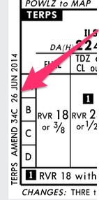
So, while the Jeppesen plate may have a date of “4 JUL 14” on the top of the plate, it will still have an official “TERPS AMEND” date it gets from the FAA.
You can find that official date on the bottom left hand corner of the plate as I have shown below.
The FAA on the other hand only uses one date on the plate: the official “TERPS AMEND” date.

The “TERPS AMEND” dates will let you know if you have the most updated chart compared to your co-pilot.
Comparing the latest chart number is easier than comparing the dates, though. Whoever has the larger number (14177 vs 14176) has the latest plate on the FAA charts.
Difference #2: “Briefing Strip”
I just learned the term “briefing strip” is actually a trademark of Jeppesen plates. Look:
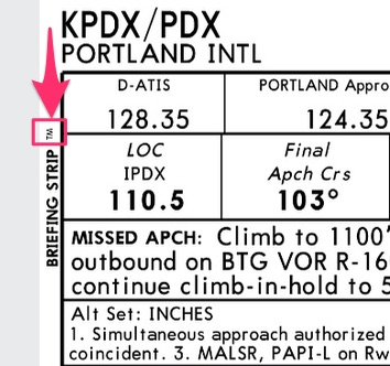
I had no idea. I have been using that term for a while, but I didn’t know where it came from.
There is a good reason Jeppesen plates trademarked the “briefing strip.” The primary difference between FAA and Jeppesen approach plates is the “Briefing Strip.”
Jeppesen wants all the information you need to brief an approach at the top of the chart. It makes life a lot easier for aircrews.
Jeppesen plates are usually used in cockpits with two pilots so this makes a lot of sense. Plus, they are a business, they need to give their customers a reason to drop all that money on their plates!
You could ignore the rest of the plate and still get everything you need from the briefing strip. You can get the same information from the FAA chart, you just have to jump around.
Here are the two “briefing strips” side by side, starting with the Jeppesen plate:
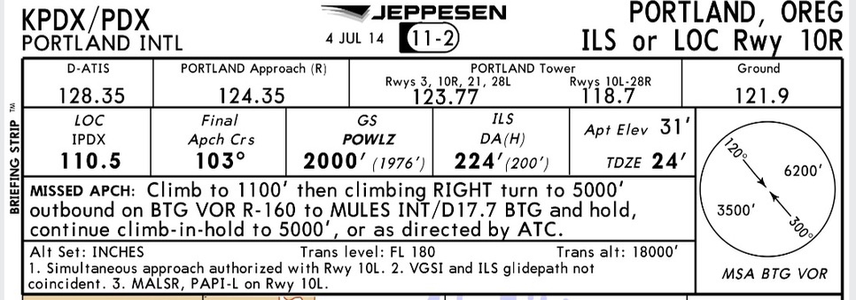

As you can see, the Jeppesen plate streamlines the information. It puts the information you see above in the FAA plate in other areas.
Difference #3: Plan View
I have found Jeppesen’s goal is to simplify and condense. The plan view is no exception.
As you can see the Jeppesen graphic portion is cleaner (except for all the arrows I drew to highlight differences):
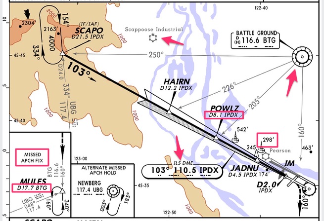
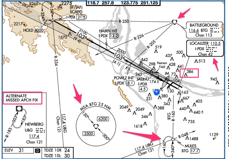
I used the pink arrows point out a few of the differences.
Below is a written list of the differences:
- The Jepp plates use different icons for their VORs and ILSes. The FAA charts use similar boxes, so you need to pay close attention to distinguish between the Localizer frequency or the VOR.
- The FAA charts use little boxes around their distances from VORs.
- Look at the FAA chart which shows MULES 17.7 NM from the BTG VOR. Notice the Jepp charts don’t outline/circle any distances. They use the word “D” before the distance instead.
- The “D” is consistent across all Jepp charts to denote distances.
- The FAA charts put the MSA chart in the plan view which is very helpful in my opinion.
- This is the altitude you cannot descend below if you are cut lose by ATC to do the approach. You may hit a mountain (and people have) if you descend too early. The Jepp plates put it in the briefing strip because they think it’s important to brief.
- Notice the FAA charts put almost every damn antenna in Portland in the plan view. The Jeppesen plates are a little more discerning with their antenna heights. It’s cleaner.
- The FAA plate does not include local airports. I drew an arrow to the Scappoose airport symbol on the Jeppesen plate to show you what an airport on a Jeppesen plate looks like.
- The Jeppesen plates puts the missed approach and alternate in their own boxes. The FAA charts like to put the missed approach in the plan view to show you holding in relation to the airport. The FAA will put the alternate in a box when applicable.
Difference #4: Side View
The side views are very different mainly because the FAA charts throw a miniature airport diagram into the bottom of their approach plates and the Jeppesen plates leave out that detail.
Look:
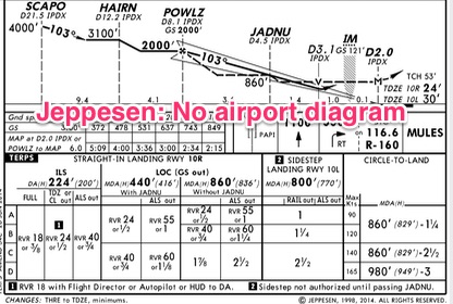
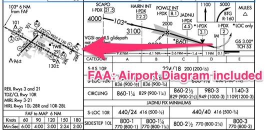
Omitting the diagram frees up more room in the Jepp plates for a stretched side view.
Check out the side view starting with the Jeppesen plate:


Sometimes in an attempt to clean up the plate, the Jeppesen plates leave out information you have to find elsewhere.
For example, look at the star (*) next to the 860 feet. I drew and arrow to it.
Notice on the FAA chart it tells you it’s for the Localizer only. On the Jeppesen plate you have to go to the section with DH/MDA to interpolate that information.
The Jeppesen plate also omits the line under the altitudes. In this case, you would have to know that 4000′ is a hard altitude on the Jeppesen plate.
The FAA plate underlines 4000′ (I drew an arrow to it) so you can quickly identify mandatory altitudes.
The FAA adds two things you won’t find on the side view in a Jepp plate:
- The graphical depiction of the missed approach
- A note about “VGSI and ILS glidepath not coincident.” You have to go back to the top of the plate and put on your glasses to find that information on the Jeppesen plate:

TEACHING TANGENT: If you have ever flown an approach where the glidepath and Visual Glideslope Indicator (VGSI) aren’t coincident, you know how annoying it is to find yourself perfectly on glidepath on your instruments, but off when you look at the PAPI.
This also happens when approach angles are greater than 3 degrees.
I recommend when you break out, transition to flying the PAPI (or other VGSI) with only an occasional glance at your glidepath.
The glide path on your instruments is still helpful, but you will drive yourself crazy trying to stay on the glidepath when the PAPI tells you a different story.
Any distraction while trying to land is a bad thing, and jockeying with the glidepath vs the PAPI is a distraction.
You won’t notice this problem when you break out close to minimums because you might not see the PAPI before you flare and land.
Difference #5: MDH/DH and Circling Minimums
The main difference here is how the information is arranged.
The Jeppesen plates follow a vertical format and the FAA charts arrange the information horizontally.
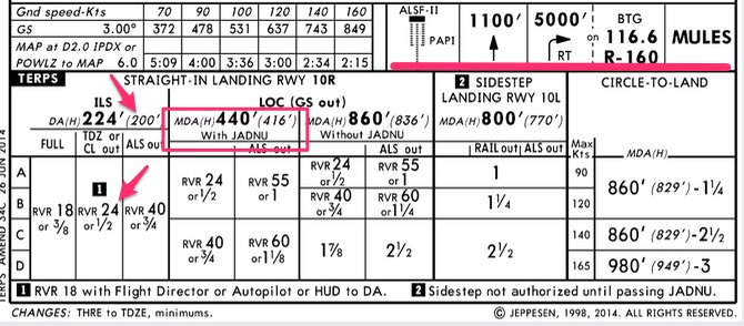
The Jeppesen plates also add the visual depiction of the missed approach procedure and the descent rates to the top portion.
Another nice feature of the Jeppesen plates is they do the math for you if any of the lighting systems are out.
In the FAA charts, you have to go back up to the “briefing strip” section and look at the notes to find out what your new MDA/DH numbers are.
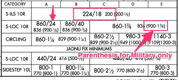
In the Jeppesen plates you will notice the Height Above Touchdown (HAT) is in parenthesis whereas the FAA charts place the HAT to the right of the DH and visibility for the approach.
For example, on the ILS the DH is 220 feet and the required RVR is 1800. Just to the right of those numbers you will see the “200” which means when you are at minimums you are 200 feet above the ground.
TEACHING TANGENT: The HAT useful to know. If the ceilings are 600′ and the HAT is 200′ you will have 400′ between you and the clouds when you break out.
You should do this math right after getting ATIS and before descent so you know when you will break out.
Difference #6: No military information on Jeppesen plates
Take a look at the FAA charts and notice how it adds additional information in parenthesis to the right of the HAT.
These numbers are for military pilots only. It helps them determine if they need an alternate.
The Jeppesen plates do not have information for military pilots on their plates. You are out of luck.
Usually military pilots flying overseas will use the DOD approved plates which mirror the FAA charts, so they have access to this important planning information.
For example, the ILS shows (200-1/2) for weather planning minima. As an Army fixed-wing pilot I add 400′ and 1 mile visibility to that number to get 600 and 1 and 1/2. If the weather is less than 600 1 and 1/2 within an hour of landing, I must plan for a landing alternate.
Likewise, if the weather is less than 200 1/2 when I takeoff, I must plan for a takeoff alternate.
TEACHING TANGENT: Civilian pilots (operating under Part 121 and 135) using Jeppesen plates must refer to the Airport Diagram for takeoff and landing minimums. See Part 1 of this article for where to find that info.
Part 91 civilian pilots have no takeoff minimums or takeoff alternate requirements, although you are a fool if you don’t give yourself some personal minimums.
For four different recommendations on suggested personal minimums check out this article: What are standard takeoff minimums?
I also recommend you plan for a takeoff alternate when the weather is below the MDA/DH for the approach.
If you have an emergency on takeoff and the weather is less than the MDA/DH, how will you get back into the airport you just left? You will need another airport, and trying to chose one in the air during an emergency is foolish.
Part 91 pilots can also initiate approaches when the visibility is less than required for the approach (ie 1/2 mile visibility or 1800 RVR).
Part 121 and 135 pilots have to have certain RVR requirements before they can even attempt an approach.
The military mirrors Part 91 in that they can initiate any approach regardless of weather.
However, no matter who you are, in order to descend below MDA/DH you have to make sure “the visibility is not less than the visibility prescribed in the standard instrument approach being used.”
If the visibility for the ILS is 1/2 mile then you must have 1/2 mile visibility to go below the MDA/DH.
The visibility, not ceiling is controlling.
Additionally, you can’t go below 100′ AGL until you see some of the approach or runway lights. There is a whole long laundry list I won’t go into. They are listed in CFR Part 91.175. You can click on that link to read the pdf.
How are standard instrument departure charts different between Jeppesen and the FAA?
Let’s start with some examples. Take a second to digest the different plates.
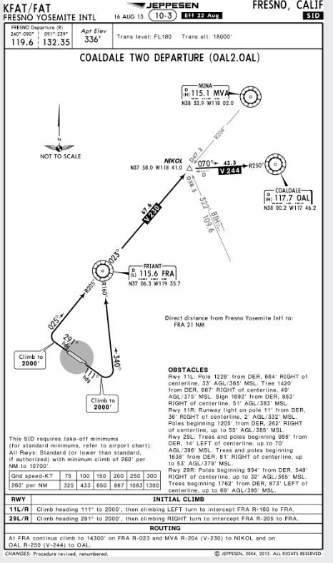
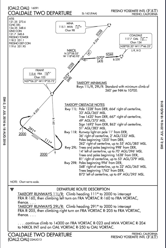
The first is the Jeppesen plate for the Coaldale Departure out of Fresno, CA. The second is the FAA’s version.
How do Jeppesen and FAA charts label their SIDs?
As with approach charts, the chart numbers are displayed completely differently.
Each organization uses its own labeling system. You can’t move back and forth between the labeling system.
The “SL-162” and “16091” on the FAA chart below means nothing in the Jeppesen world. Jeppesen chose to call their plate “10-3” although that number is not specifically for that plate. They group their plates in city/metro areas.
The FAA and Jeppesen put their plate revision dates in completely different places as well. For the Jepp plates it’s up top, and for the FAA it’s at the very bottom.
It’s important to be able to locate the chart numbers and revision dates. You need to know if it’s the latest plate. These numbers help you update your charts.
You also need to be on the same plate as your co-pilot when you brief the approach. These numbers will quickly tell you if you and your pilot pulled up different plates. I have done it many times before, and the “10-3” vs “11-2” is a quick way to see you aren’t on the same page.
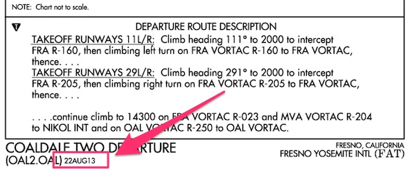
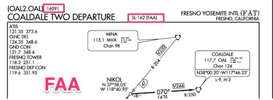
Look at the two snapshots of the FAA chart above compared with the Jeppesen plate below. Jeppesen puts all the information in one place at the top.

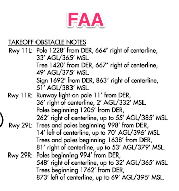
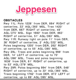
How are takeoff obstacle notes different?
The obstacle descriptions look different between the two. I would argue the FAA notes are easier to read because they are clearly broken up between runways. Either way, they are pretty straightforward and I don’t need to say much more about them.
Where are takeoff minimums located in Jeppesen and FAA charts?
Takeoff minimums are extremely important when trying to figure out if you have the climb performance to leave.
Some operations require you to meet the climb gradient on a single-engine, but Part 91 is quite liberal. Part 91 doesn’t care if you lose an engine and plow into the side of a mountain because your small twin can’t meet the climb gradient on one engine.
As a rule of thumb, I would start to get worried if you saw anything over 300′ per NM. But I am of the opinion you should meet these gradients with one engine. It’s your life. Do what you like.
Just have a plan if you lose an engine because you will have to get around the obstacles on one engine. You should know the climb performance of your aircraft on one engine in fpm and in ft per NM.
Memorize those numbers. It will help you quickly identify departure procedures with difficult takeoff minimums.
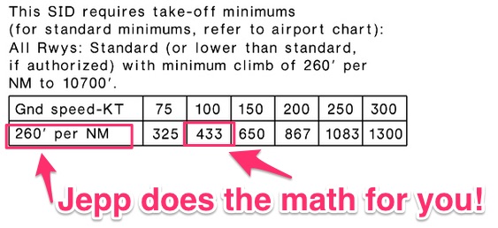
The biggest difference, besides the location, is the Jepp chart converts climb gradient into a useable number. Notice on the Jepp chart, 260′ per NM translates into 433 feet per min climb on your VSI at 100 knots.
With the FAA charts you are on your own to do the math.
Check it out:

How are departure descriptions different between Jeppesen and FAA charts?
The departure initial climb and routing descriptions are perhaps the most important sections besides the takeoff minimums.
Both are located at the bottom of their respective chart. Or, as often in the case with FAA charts, they are on a completely separate page.
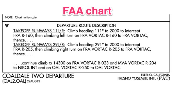
Take a minute to look at the differences. Jeppesen breaks out the route from the initial climb whereas the FAA chart uses continuation dots to indicate the “routing” part.
Check it out…a picture is worth a thousand words.

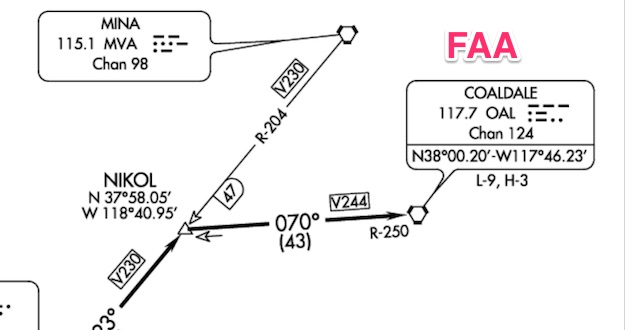
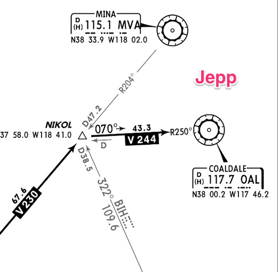
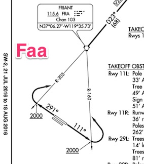
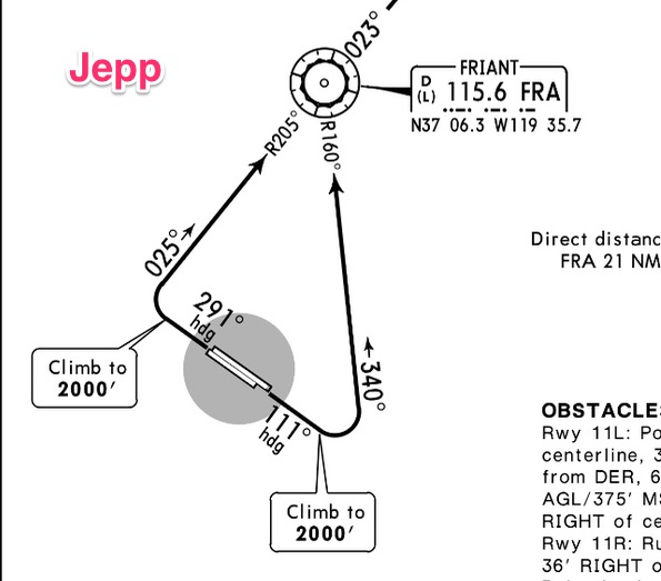
How are the Jeppesen graphics different from the FAA chart graphics?
The last major difference between the charts are the graphics and symbols used by each organization.
Below you will find several charts. Scroll through them to get a rough idea of the differences.
Hey! One more thing!
Did you like this article? I email my readers every week with more articles just like this. The thing is these articles aren’t on my blog! You can only get them by subscribing.
Still don’t want to join my email list? That’s okay. You can still download a FREE Ultimate Guide to Decoding NOTAMs below. You can unsubscribe after you downloaded the guide. I don’t mind, seriously! I’m here to help!
Discover more from reviewer4you.com
Subscribe to get the latest posts to your email.


